Retool's Blog
In 2024, we were driving hard toward Content becoming a key contributor to Retool’s organic growth strategy. Having a killer blog was part of that plan. Our goal was to create a beautiful, navigable, engaging, and high-conversion blog that’s easy to use, well-instrumented for measurement, and ready to go as quickly as possible. I contributed to both the design and the development of this project that can be found here.

Developer-First Engagement:
Visual and Verbal Identity: The design refresh focuses on resonating with developers by using a clean, minimalistic aesthetic that emphasizes functionality and professionalism. The use of technical jargon and developer-centric topics enhances credibility.
Trust and Traction: The layout and content strategy build trust by showcasing high-quality, relevant content prominently, establishing the blog as a go-to resource for developers.
Curated and Functional Landing Page:
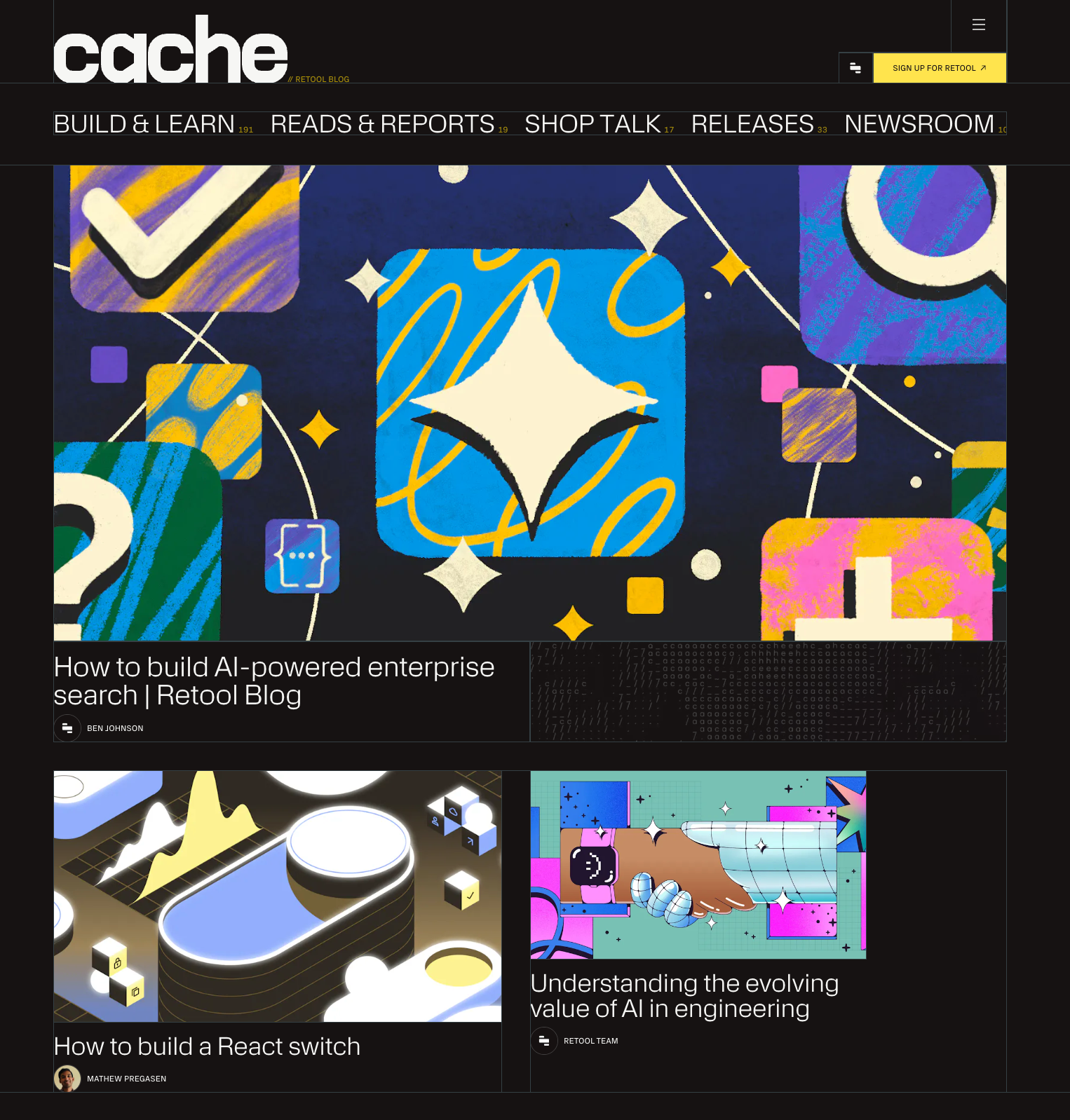
Home/Landing Page: The blog avoids a cluttered stream-of-consciousness layout by featuring curated, high-priority content in an organized manner. Clear call-to-actions (CTAs) and engaging modules drive user interaction and conversions.
Visual Appeal: The consistent use of a soothing color palette, ample white space, and high-quality visuals make the landing page aesthetically pleasing and inviting.
Improved Discovery Experience:
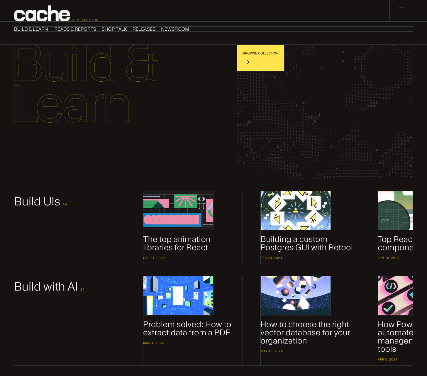
Site Structure and Navigation: Enhanced navigation menus and a new search functionality improve content discoverability. Users can effortlessly find articles, collections, and categories tailored to their interests.
Content Strategy: The blog’s structure and categories are meticulously planned to guide users through a logical content journey, ensuring they find valuable and relevant information easily.
Article Templates: Data-driven design improvements to article templates enhance readability and engagement. Interactive elements and strategically placed CTAs boost conversion rates.
Landing Pages: Thoughtfully designed landing page supported specific campaigns and goals, increasing the likelihood of user interaction and retention.
Key Components and Page Refreshes
Navigation: Streamlined to improve user experience and content access.
Homepage: Curated to highlight top-performing content and drive engagement.
Article Page: Enhanced for better readability and user interaction.
Search Functionality: Newly implemented to aid content discovery.
Collection Page: Introduced to group related content, making exploration easier.
These design choices collectively aim to make the Retool blog a central part of Retool’s content strategy, driving organic growth by creating a user-friendly, engaging, and high-conversion platform for their target audience.
