
Work for Amazon
Amazon Web Services (AWS) offers reliable, scalable, and inexpensive cloud computing services. While working at AWS, my responsibilities covered various areas across their email team in an effort to promote efficiencies and reduce manual work in various existing programs.
I primarily assisted in coding web pages, creating A/B tests for event registration pages, and documented my learnings from the data I collected to act as guides for future web builds. I helped design and build over thirty effective landing pages for major AWS events, spent a lot of time working on the mobile version, and worked closely with the optimization and design portion of the project.
Key Projects and Initiatives
Having previously had full-time experience in web development, intuitive user interface design, and marketing, I provided assistance with email campaigns and offered general code support for email template builds and Marketo landing pages, ensuring overall functionality of our digital marketing collateral for maximum compatibility across all popular browsers, devices, and email clients whenever needed.
Additionally, my responsibilities included defining the AWS event experience through email communications, developing new communication programs to improve demand generation and attendee communications, optimizing event registration and attrition rates, iterating on ongoing programs and post-event communications, executing robust test plans, building out reporting dashboards, and performing deep analysis to improve the effectiveness of these programs.
Greenfield Landing Pages
One of my major assignments was optimizing our Greenfield landing pages. The purpose of this nurture program was to target Enterprise/Mid-Market Named customers and prospects within our Greenfield accounts with an automated drip email campaign that promoted AWS Enterprise Solution Factory elements in an effort to educate and increase product adoption. For this specific campaign, 24 landing pages were built in total. I built all of these landing pages in Marketo from scratch, working with multiple stakeholders, including the NA Field Marketing Team, to ensure their needs were met, while raising the bar on layout and design enhancements. These landing pages included different content varieties from whitepapers to customer success stories.
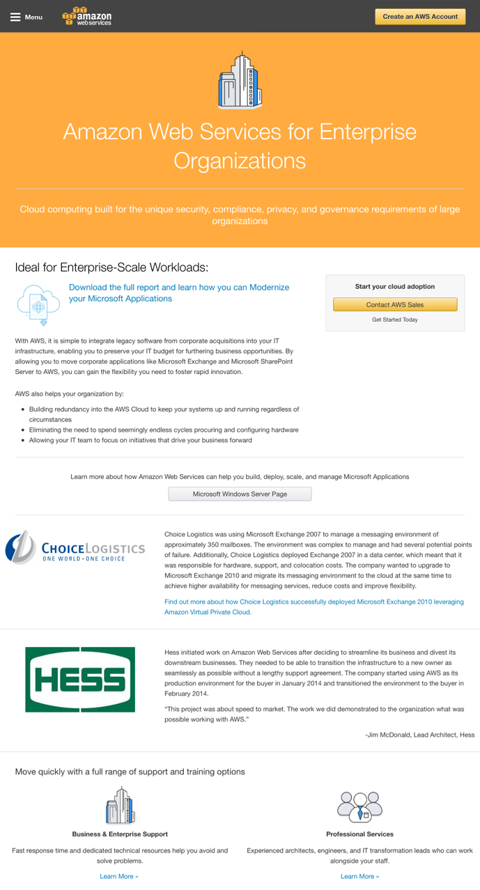
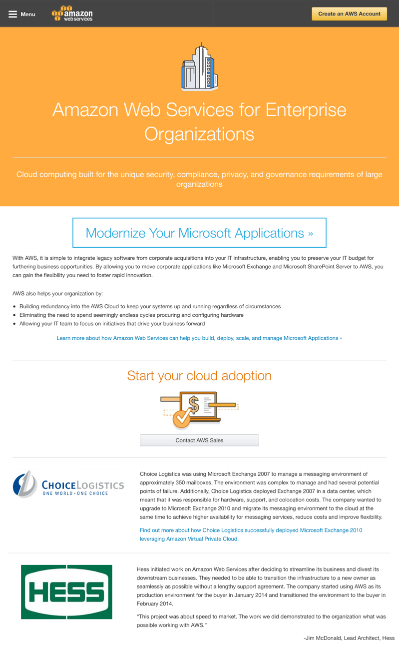
The alterations I made for the Greenfield pages involved changing the CTA button, shortening the CTA, and moving “Contact AWS Sales” to a lower region of the page. The reasoning behind these alterations was supported by research I conducted which showed that certain button colors can improve engagement. An example of this is in a study that HubSpot conducted, which found that utilizing a red button outperformed green by 21%. They did not have to increase traffic to the page to see results. I concluded this was definitely a priority of ours to test these sorts of features out on our landing pages. Further, I wanted to test out shorter CTA button copy for the Greenfield pages. For example, instead of a CTA that says “Download the full report and learn how you can modernize your Microsoft Applications” my layout has a CTA that is simply “Modernize Your Microsoft Applications”. A few examples of my work and designs for these landing pages can be seen below.
Designing and Optimizing Event Registration
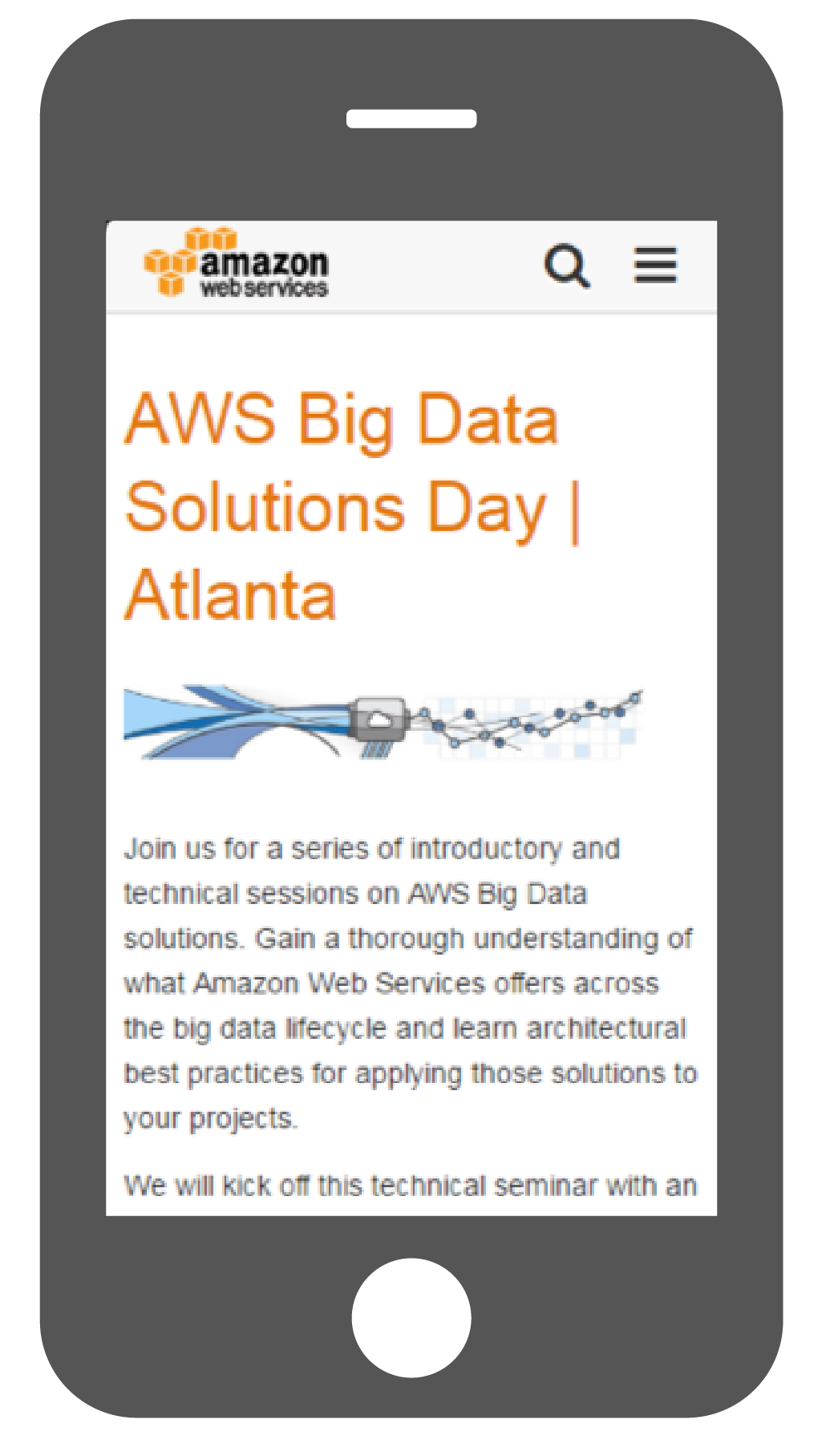
One of my other major assignments was optimizing event registration pages for tier 2 and tier 3 field marketing events. I began by working off of initial directions outlaid by my manager, stakeholders, and other members of the marketing team. My challenge was to make the text heavy event registration pages visually interesting and seamlessly lead users through the event registration process. I focused on breaking up information into tabs and sections that would not be a dead end, and would hold the call to action to more superior importance.
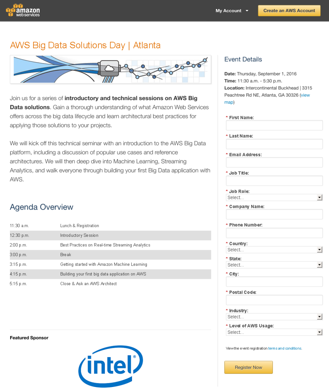
Another primary objective of mine was to ensure that the registration pages were just as functional and well-designed on mobile as they were when viewing them on a desktop. Further, I took notice of how the registration form on the mobile version, was buried by the overflow of information on the page as can be seen in the image below on the left. I decided to test out the idea of a one column landing page versus the two column landing page that was currently being used across all our tier 2 and tier 3 events. This test was conducted by setting up a control version of the landing page with the standard two column template and a test version of the landing page featuring expandable sections for the “Event Details” and “Agenda” as well as a one-column approach to the overall page layout as can be seen in the image below on the far right. The primary difference between the two involved the removal of a second column of information that played a supporting role. I hypothesized that a shorter landing page helps readers digest information more easily, thereby increasing the likelihood they will fill out the form. Through this test we found that with my one column landing page outperformed the two column template with an uplift of 33.79%. The development and evolution of my testing can be seen from the screens below from left to right.
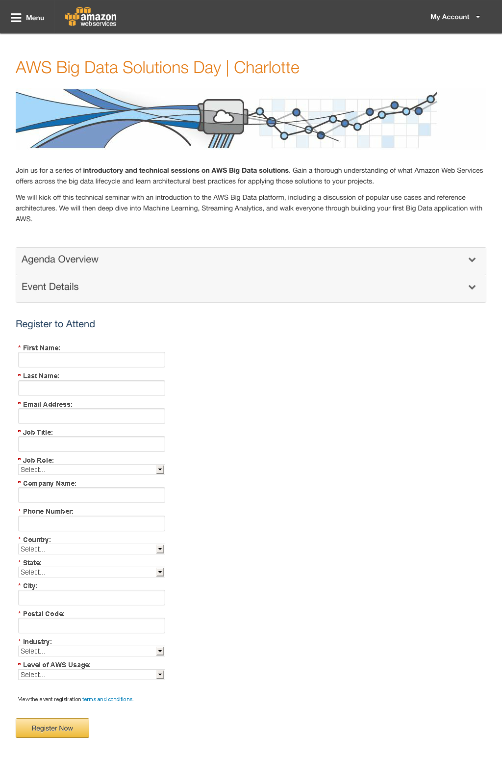

Tabbed Event Registration Page
The hypothesis of this test was that the use of a landing page utilizing tabbed sections to provide the event content will improve registration conversion rates over the use of the one column landing page template that had been previously tested. This test was conducted by setting up a control version of the landing page with the one column template (populated with the registration form, event details, and agenda overview) and a test version of the landing page with a tabbed design consisting of horizontal tabs with a registration form, agenda overview and event details as shown on the left. From my testing, we see an uplift of 23% in conversion rate with the use of my tabbed landing page template versus my one column landing page. The statistical significance met the 95% threshold needed, so it can be seen that these results can be taken into consideration for future development.
Adding SMS Alerts
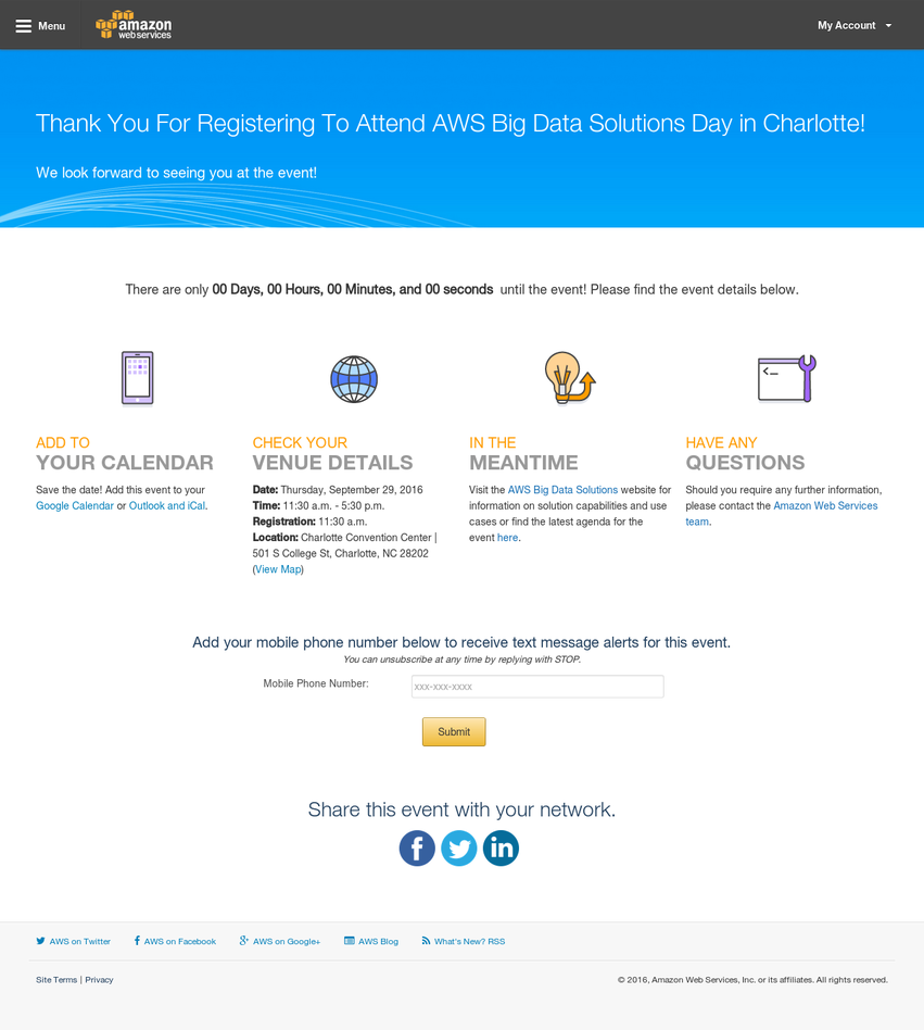
A thank you page is the page that someone is redirected to after filling out a registration form on one of our landing pages. It’s where we have the opportunity deliver on the promise we made on the last page (i.e. register for the event, video, etc.), and most importantly, it’s your next opportunity to nurture the lead. Previously, the AWS event registration confirmation page was fairly plain and afforded a big opportunity to optimize.
I was given full creative freedom to optimize our confirmation pages and to run an A/B test to compare who attended the event after registration when led to my new and optimized confirmation page in contrast with our old one. As can be seen on the right, I created a more robust confirmation page with various tokenized features that included an add to calendar feature, live countdown that displayed the days, hours, minutes and seconds to the event, the ability to share the event across social networks, and opt-in for SMS text alerts. This would allow registrants to get all the event details immediately without having to wait for the event confirmation email and created a robust post-registration experience.
Conclusions & Key Takeaways
My projects were focused on conducting research that helped in optimizing the customer event registration experience, driving conversion rates to better improve the effectiveness of email demand generation for events, and delivering new tokenized programs that allow marketers with no coding experience to create responsive landing pages capitalizing on our optimization tests.
The impact of my project can be evaluated across two dimensions: customer impact and internal team efficiency. In regards to internal team efficiency, through the use of my landing page programs, building field events takes significantly less time thanks to the pre-built and tokenized options now offered. When it comes to customer impact, I’ve optimized the event registration landing pages to ensure the best experience for our customers is backed up by the results of my testing. Through my projects, I opened the door for future testing to build off of my successes, optimizing event landing pages, and iterating on the event registration experience.