Merck Accelerator Website

Merck is a German multinational that specializes in the areas of chemical, pharmaceutical and life sciences. They became a client of RCKT and it became our responsibility to help design, build, and optimize their website. The main focus of the website was to showcase their new Accelerator project as well as get them new prospective clients. I worked alongside the design team at RCKT. to successfully develop a website that articulated the company’s value and vision. I assisted in updating websites for both their German and American target audiences.

Developing the Design

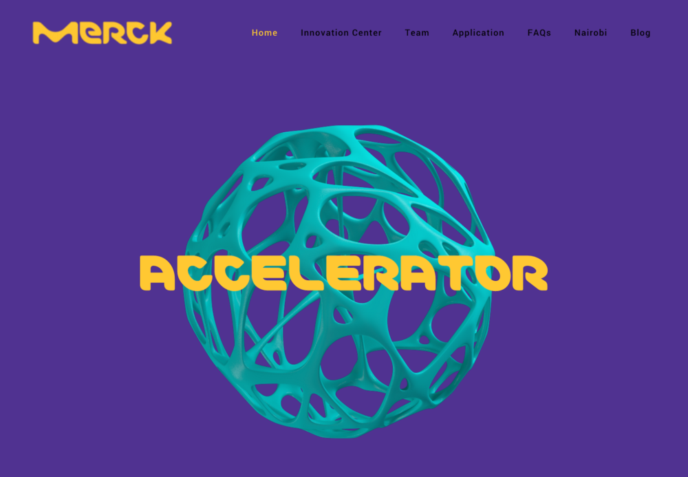
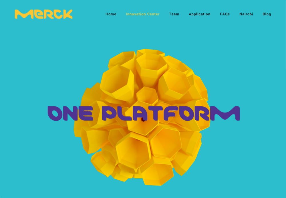
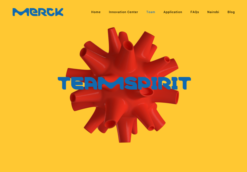
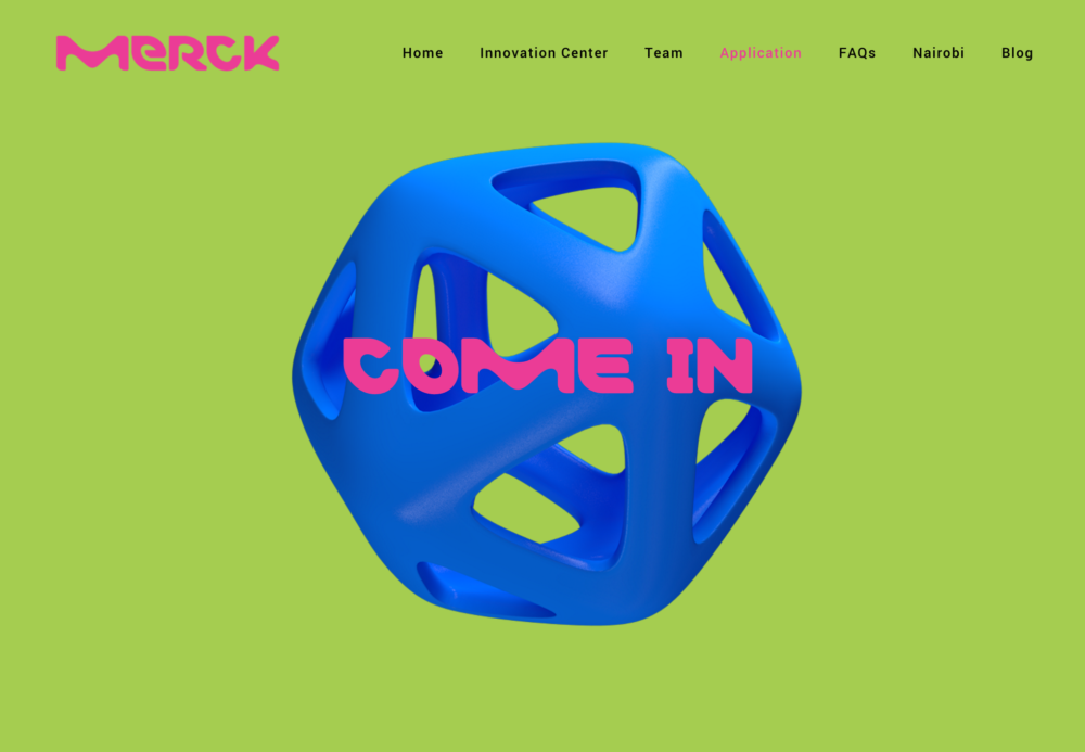
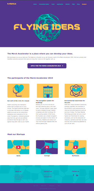
Upon agreement with team members of the design and development team, we developed a layout with a hero at the top with the CTA button just below. Our intention was to create a website that delivers information quickly and efficiently, which is reflected in the bold branding with a focus on so many different colors. We chose abstract and geometric images accompanied by a bold color scheme to draw the viewer in.

Implementation

We explored a lot of options for the logo treatment but ultimately decided the best course of action was to utilize our bold color scheme to have the logo change throughout the different pages. For example, the logo is yellow on the home and innovation center page, but blue on the team page, and green on the application page. We also made sure to reflect this color scheme in the accent colors. After making the final design decisions and receiving approval, I then implemented the design into a functional web page.  The website was built with HTML, CSS, JavaScript, Bootstrap, and PHP.

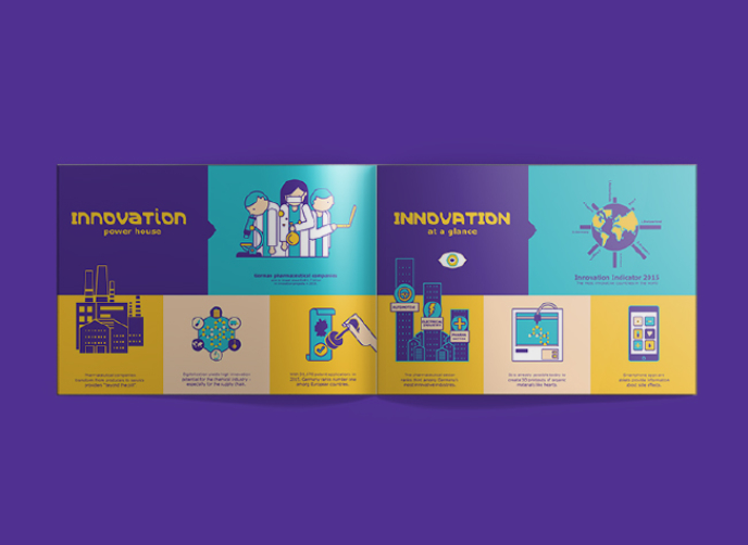
In addition to designing, branding, and creating a website for Merck, RCKT. was also responsible for creating press releases, website content, brand and campaign concepts, advertisements, blogs and social media channels to create attention for the accelerator. I worked alongside team members for various of these tasks, including some seen below.